'%3e%3cpath%20d='M367.654%20-98.3684C471.693%20-141.396%20587.044%20-106.973%20625.298%20-21.4824C663.551%2064.0083%20509.196%2026.5339%20405.157%2069.5616C301.118%20112.589%20247.731%20367.393%20209.477%20281.902C171.224%20196.411%20263.616%20-55.3407%20367.654%20-98.3684Z'%20fill='url(%23paint0_linear_941_1795)'%20fill-opacity='0.5'/%3e%3c/g%3e%3cdefs%3e%3cfilter%20id='filter0_f_941_1795'%20x='0.659912'%20y='-316.906'%20width='830.599'%20height='816.223'%20filterUnits='userSpaceOnUse'%20color-interpolation-filters='sRGB'%3e%3cfeFlood%20flood-opacity='0'%20result='BackgroundImageFix'/%3e%3cfeBlend%20mode='normal'%20in='SourceGraphic'%20in2='BackgroundImageFix'%20result='shape'/%3e%3cfeGaussianBlur%20stdDeviation='100'%20result='effect1_foregroundBlur_941_1795'/%3e%3c/filter%3e%3clinearGradient%20id='paint0_linear_941_1795'%20x1='154.859'%20y1='159.838'%20x2='614.418'%20y2='-45.7961'%20gradientUnits='userSpaceOnUse'%3e%3cstop%20stop-color='%23FB923C'/%3e%3cstop%20offset='1'%20stop-color='%234ADE80'/%3e%3c/linearGradient%3e%3c/defs%3e%3c/svg%3e)
'%3e%3cpath%20d='M294.402%20570.656C184.83%20596.53%2076.4509%20544.141%2052.3301%20453.641C28.2092%20363.141%20174.606%20424.767%20284.178%20398.893C393.75%20373.019%20487.115%20130.001%20511.235%20220.5C535.356%20311%20403.974%20544.782%20294.402%20570.656Z'%20fill='url(%23paint0_linear_682_6481)'%20fill-opacity='0.5'/%3e%3c/g%3e%3cdefs%3e%3cfilter%20id='filter0_f_682_6481'%20x='-150.308'%20y='0.405273'%20width='864.438'%20height='776.86'%20filterUnits='userSpaceOnUse'%20color-interpolation-filters='sRGB'%3e%3cfeFlood%20flood-opacity='0'%20result='BackgroundImageFix'/%3e%3cfeBlend%20mode='normal'%20in='SourceGraphic'%20in2='BackgroundImageFix'%20result='shape'/%3e%3cfeGaussianBlur%20stdDeviation='100'%20result='effect1_foregroundBlur_682_6481'/%3e%3c/filter%3e%3clinearGradient%20id='paint0_linear_682_6481'%20x1='545.675'%20y1='349.716'%20x2='59.1901'%20y2='479.379'%20gradientUnits='userSpaceOnUse'%3e%3cstop%20stop-color='%23FB923C'/%3e%3cstop%20offset='1'%20stop-color='%234ADE80'/%3e%3c/linearGradient%3e%3c/defs%3e%3c/svg%3e)
Vueless UI 1.X.X is out! 🚀
A
Built-in Storybook
UI Library
with Built-in Storybook
Create your Design System in Day, not Weeks. Built for Vue & Nuxt with 💚
'/%3e%3c/svg%3e)
Styled with Tailwind CSS v4
Beautifully styled by default, overwrite any style you want.
'%3e%3c/path%3e%3c/g%3e%3c/svg%3e)
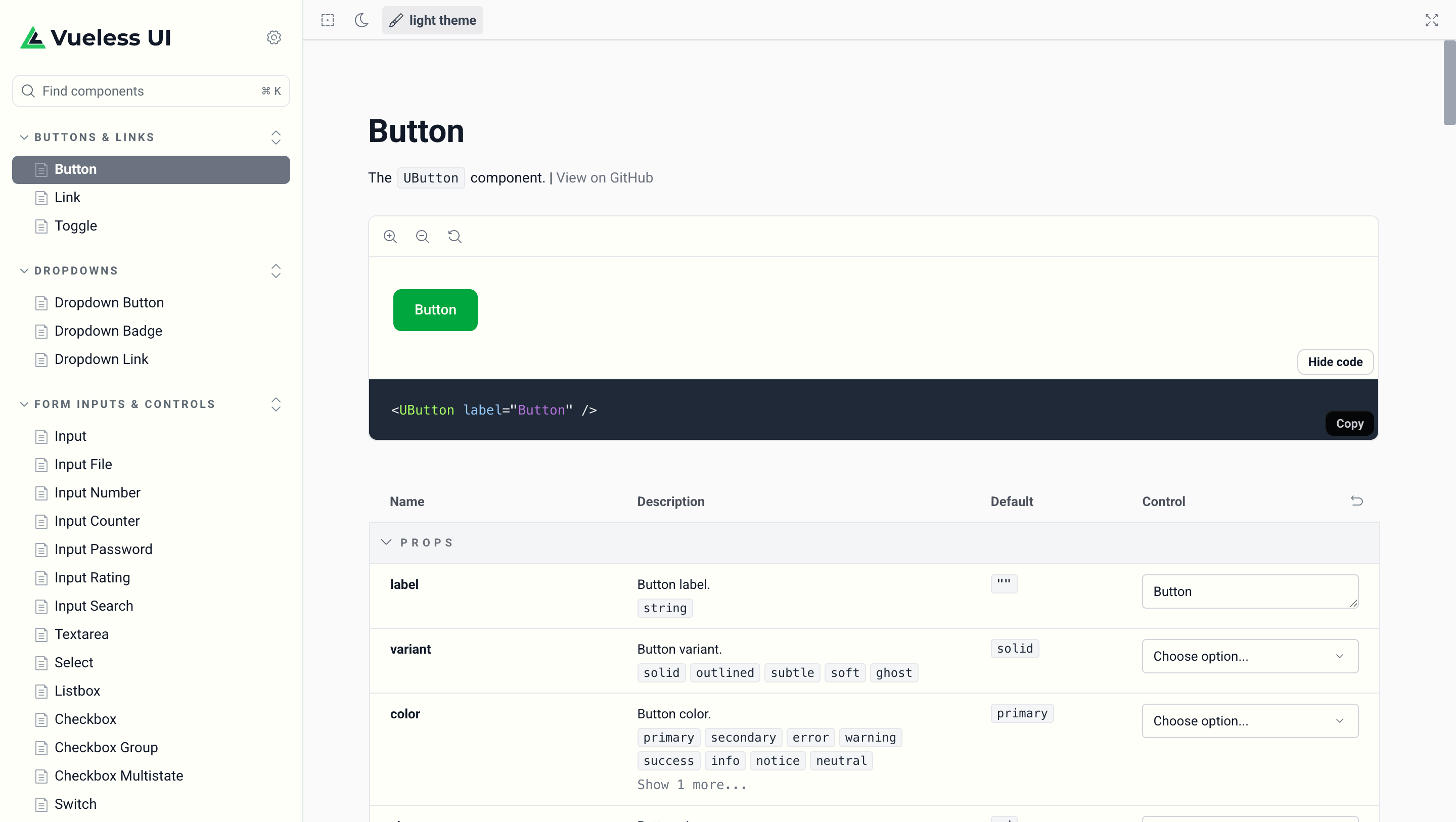
Built-in Storybook Support
Style, test, and document your UI components in isolation.

Type-safe with TypeScript
Auto-complete and type safety for all components.
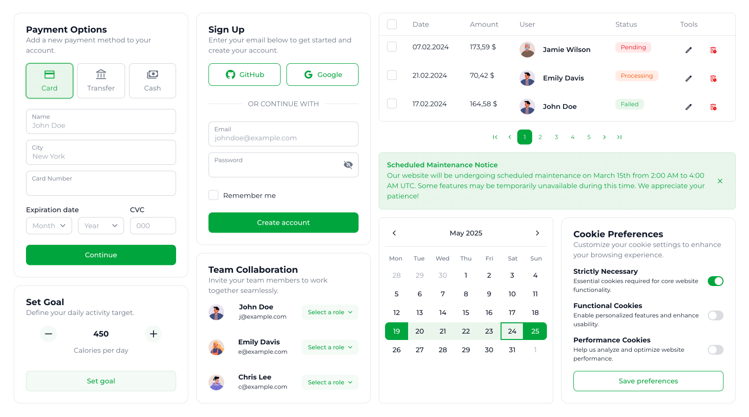
Explore 60+ Crafted UI Components
Built-In Storybook That Works
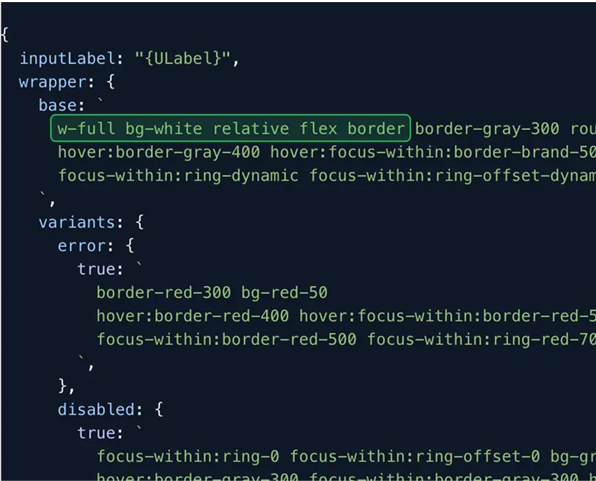
Theme Builder — Fast, Simple, Intuitive

Features You'll Love
Limitless customization via global or local component configs.
Light and dark modes out of the box.
Primary and Neutral color palettes with runtime change.
Storybook preset for effortless component styling in isolation.
Top-notch TypeScript support with types and tooling assistance.
'%3e%3cpath%20d='M211.802%20-18.8017L42.9062%20-41.1798C34.2693%20-42.3241%2026.34%20-36.2503%2025.1957%20-27.6134L2.81756%20141.282C1.6732%20149.919%207.74709%20157.848%2016.384%20158.993L185.279%20181.371C193.916%20182.515%20201.846%20176.441%20202.99%20167.804L225.368%20-1.09119C226.512%20-9.72807%20220.438%20-17.6573%20211.802%20-18.8017Z'%20fill='%233178C6'/%3e%3cpath%20fill-rule='evenodd'%20clip-rule='evenodd'%20d='M124.192%20129.098L121.33%20150.695C124.604%20152.96%20128.579%20154.86%20133.256%20156.396C137.932%20157.931%20142.927%20159.05%20148.241%20159.754C153.419%20160.441%20158.404%20160.597%20163.196%20160.225C167.987%20159.853%20172.29%20158.763%20176.103%20156.957C179.916%20155.15%20183.09%20152.549%20185.626%20149.153C188.16%20145.758%20189.785%20141.361%20190.5%20135.962C191.019%20132.047%20190.888%20128.539%20190.108%20125.436C189.328%20122.334%20187.986%20119.49%20186.083%20116.903C184.182%20114.316%20181.808%20111.907%20178.966%20109.676C176.123%20107.445%20172.872%20105.263%20169.214%20103.131C166.532%20101.584%20164.139%20100.112%20162.033%2098.7112C159.928%2097.3104%20158.163%2095.9324%20156.739%2094.5758C155.315%2093.2198%20154.26%2091.8436%20153.574%2090.4479C152.889%2089.0522%20152.653%2087.5451%20152.868%2085.9249C153.065%2084.4401%20153.624%2083.1529%20154.548%2082.0618C155.471%2080.9708%20156.688%2080.0906%20158.197%2079.4209C159.706%2078.7504%20161.505%2078.314%20163.594%2078.1095C165.683%2077.9056%20167.966%2077.9679%20170.443%2078.296C172.244%2078.5347%20174.129%2078.922%20176.096%2079.4572C178.065%2079.9925%20180.024%2080.6754%20181.977%2081.507C183.928%2082.3376%20185.804%2083.307%20187.605%2084.4161C189.405%2085.5242%20191.042%2086.7484%20192.513%2088.0875L195.187%2067.9084C192.067%2066.2132%20188.599%2064.8038%20184.785%2063.6802C180.971%2062.5566%20176.541%2061.661%20171.498%2060.9928C166.365%2060.3126%20161.429%2060.2196%20156.69%2060.7135C151.951%2061.2067%20147.681%2062.3922%20143.881%2064.2693C140.081%2066.1472%20136.929%2068.7625%20134.422%2072.1158C131.916%2075.4693%20130.329%2079.6653%20129.661%2084.7048C128.809%2091.1385%20129.939%2096.8736%20133.052%20101.91C136.165%20106.946%20141.295%20111.541%20148.442%20115.693C151.254%20117.302%20153.865%20118.86%20156.276%20120.371C158.688%20121.881%20160.745%20123.389%20162.447%20124.896C164.149%20126.403%20165.442%20127.971%20166.326%20129.599C167.21%20131.227%20167.526%20132.986%20167.276%20134.876C167.091%20136.27%20166.582%20137.519%20165.748%20138.622C164.916%20139.725%20163.753%20140.624%20162.264%20141.319C160.775%20142.015%20158.972%20142.474%20156.858%20142.697C154.744%20142.921%20152.313%20142.851%20149.566%20142.487C144.883%20141.867%20140.354%20140.431%20135.979%20138.18C131.603%20135.929%20127.674%20132.902%20124.192%20129.098ZM95.3158%2070.5848L123.088%2074.2646L125.444%2056.4821L48.0339%2046.2255L45.6778%2064.008L73.3146%2067.6698L62.824%20146.846L84.8252%20149.761L95.3158%2070.5848Z'%20fill='white'/%3e%3c/g%3e%3cdefs%3e%3cclipPath%20id='clip0_978_2278'%3e%3crect%20width='201.922'%20height='201.922'%20fill='white'%20transform='translate(27.2677%20-43.2518)%20rotate(7.54754)'/%3e%3c/clipPath%3e%3c/defs%3e%3c/svg%3e)
1000+ SVG icons from top icon libraries.